Retrofitting a website for mobile viewing
For a couple years I had toyed with the idea of optimizing one of my websites for the mobile workforce. I mean, who wouldn't want to view the latest, up-to-the-minute tXtFL news while taking the inbound MUNI or BARTing across the Bay? All those news clips, coming at a blazing 0.00001 posts per minute, or thereabouts.
But all questions of necessity aside, how does one actually build a mobile website? There are a ton of already-built mobile sites available, and for my tXtFL Mobile app, I made use of Blogger's new mobile template to feed up tXtFL news while trying to figure out a more permanent solution for the Text Flex website as a whole.
The problem was that when I searched for "mobile website creation," I mostly came across commercial sites for building a mobile site from scratch, using their portals. What I ultimately wanted, however, was how to port an existing website to the mobile platform, without having to completely rewrite it or compromise the full-sized site.

As I continue my search, I realized that what I was actually looking for is what's called "Responsive Web Design." The name isn't totally intuitive as I think most websites of all types these days strive to be responsive, but the idea is that sites built this way attempt to provide different views from the same raw content based on the client's platform. In other words, if someone with a desktop-sized screen views a page from my site, they see it as is. If someone with a phone checks it out, the page will responsively adapt itself using a mobile style guide to fit the smaller screen. All without requiring a separate site or special server code.
Fortunately, I found that applying the "responsive" technique to my website wasn't as challenging as I had anticipated. As I learned the steps through perusing a number of various tutorials, I figured that I would aggregate only the most salient points here, in case you might be feeling in the mood for some midnight website retrofitting yourself.
Reorganizing the page structure
My old site was built with tables. Yes, the very thing that you learn first in any web design class or tutorial not to do, that I did. I suppose that it was fashionable when I learned basic web design (from Elizabeth Castro's illustrious book, version HTML 4, still on my bookshelf). Mobilizing my page for the mobile screen by responsive design, however, makes liberal usage of page layout based on div groupings rather than by table formatting, which can then be shifted to different parts of the page based on float styles.
For example, my original layout had three columns, which fit perfectly fine on wide desktop screen, but not so fine on the thin phone screen. With a three-column table, I would somehow have to change the column structure dynamically, which could get rather dicey. With divs, however, I could defer all of the layout issues to the CSS stylesheet, which would adjust the float values of each section to align them differently, or perhaps turn off whole sections altogether, such as the unnecessary ad bar occupying the right column of the page or even the top ad.

This reorganization took the most time for the conversion process as I had to un-learn all of my tabular design principles and think in the div way. As it was something that I had wanted to do anyway, I had now found a pleasant excuse for applying it.
Identifying the page layout for mobile browsers
Converting the page to a div-based structure afforded it extra flexibility, to be adjusted based on separate stylesheets for the desktop and small, mobile screens. But first I needed to identify the page layout to mobile browsers so that they would know to look for the proper stylesheet. The first step was to specify the viewport setting to avoid scaling. While it's wonderful that mobile browsers scale big pages to fit into the small screen so that we at least have an idea of the full contents of the page we're viewing, in our case we actually want to keep the text full size and adjust the size of the page instead.
In the head section, I specified:
<meta name="viewport" content="width=device-width, initial-scale=1.0" />
The browser bypasses its scaling and reads the page as fitting in the screen width, which in the case of most mobile browsers is, well, small. Now that the browser sees the page as small, we tell it to load the stylesheet for small pages:
<link rel=stylesheet type="text/css" media="screen and (max-width: 650px), screen and (max-device-width: 650px)" href="mobile.css" />
In this case I set the screen width threshold at 650px, which I arbitrarily chose based on the fact that some old computers out there might run at 800x600px, and I didn't want them to feel too old by feeding them with a mobile version of my page.
Mobile-specific page layout
One could add the "media" tag above to each style specification in one's current CSS stylesheet, but I preferred to create a separate, mobile-specific stylesheet in which I could house all specifications for mobile screens. Not only did this make it easier for me to differentiate between stylings for the desktop and mobile platforms, but I also only needed to make the media assignment once per page, as above.
 Within the separate stylesheet, I made a number of mobile optimizations to the page. I flipped the "off" switch (ie display: none;) on both left and right columns, since the additional details they provided didn't seem useful for those on the go. For the top menu of the Text Flex home page, I decided to swap in an entirely different div for the mobile version, lacking the search box and containing an abbreviated set of links.
Images can be a challenge for at least a couple reasons. The large images we so thoroughly enjoy on our fancy big desktop displays just don't fit in the crowded phone screen. These large images also most likely don't fit our limited data plans so well. And for those of us without 4G LTE connections, the download wait times won't fit our patience so well, either. Some slightly fancier solutions I've read are to specify image width by the "max-width: 100%" property, though this route unfortunately won't solve the problem of image download size. Another solution is to use some JavaScript magic to load different images based on screen size.
 The cruder but perhaps more straightforward solution I found was simply to create separate divs with large vs. small versions of the same image. The main stylesheet turned on the large div, but the mobile sheet swapped it for the small div.
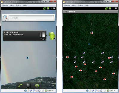
By targeting page contents based on platform, I also knew that visitors to the mobile layout wouldn't be looking for a download of the desktop tXtFL app, but rather the Android version. To prevent confusion, I simply turned off the desktop download section, leaving the Android download links prominent (and perhaps I should swipe in an Android screenshot for that desktop one).
Testing the page
One added benefit I found to responsive design is that I don't even need any special testing tools to take the site for a spin. I don't even need a mobile browser! All I need is a regular ol' desktop browser, which I then converted into a mock-mobile browser by none other than manually dragging it to a smaller size. That's it!
Well, not totally content with such a simple solution, I went out looking for a Google Chrome browser extension and found all that I was looking for in a simple extension called Window Resizer. It does exactly that (nothing more, nothing less), resizing the current window to various preset sizes. Refreshing the page brought the page all into alignment.

So I suppose that it's about time for me to migrate the rest of my site to the mobile-ready page layout structure. And maybe by the time I do so, I'll learn a few more optimizations, to begin the cycle all over again!
But all questions of necessity aside, how does one actually build a mobile website? There are a ton of already-built mobile sites available, and for my tXtFL Mobile app, I made use of Blogger's new mobile template to feed up tXtFL news while trying to figure out a more permanent solution for the Text Flex website as a whole.
The problem was that when I searched for "mobile website creation," I mostly came across commercial sites for building a mobile site from scratch, using their portals. What I ultimately wanted, however, was how to port an existing website to the mobile platform, without having to completely rewrite it or compromise the full-sized site.

As I continue my search, I realized that what I was actually looking for is what's called "Responsive Web Design." The name isn't totally intuitive as I think most websites of all types these days strive to be responsive, but the idea is that sites built this way attempt to provide different views from the same raw content based on the client's platform. In other words, if someone with a desktop-sized screen views a page from my site, they see it as is. If someone with a phone checks it out, the page will responsively adapt itself using a mobile style guide to fit the smaller screen. All without requiring a separate site or special server code.
Fortunately, I found that applying the "responsive" technique to my website wasn't as challenging as I had anticipated. As I learned the steps through perusing a number of various tutorials, I figured that I would aggregate only the most salient points here, in case you might be feeling in the mood for some midnight website retrofitting yourself.
Reorganizing the page structure
My old site was built with tables. Yes, the very thing that you learn first in any web design class or tutorial not to do, that I did. I suppose that it was fashionable when I learned basic web design (from Elizabeth Castro's illustrious book, version HTML 4, still on my bookshelf). Mobilizing my page for the mobile screen by responsive design, however, makes liberal usage of page layout based on div groupings rather than by table formatting, which can then be shifted to different parts of the page based on float styles.
For example, my original layout had three columns, which fit perfectly fine on wide desktop screen, but not so fine on the thin phone screen. With a three-column table, I would somehow have to change the column structure dynamically, which could get rather dicey. With divs, however, I could defer all of the layout issues to the CSS stylesheet, which would adjust the float values of each section to align them differently, or perhaps turn off whole sections altogether, such as the unnecessary ad bar occupying the right column of the page or even the top ad.

This reorganization took the most time for the conversion process as I had to un-learn all of my tabular design principles and think in the div way. As it was something that I had wanted to do anyway, I had now found a pleasant excuse for applying it.
Identifying the page layout for mobile browsers
Converting the page to a div-based structure afforded it extra flexibility, to be adjusted based on separate stylesheets for the desktop and small, mobile screens. But first I needed to identify the page layout to mobile browsers so that they would know to look for the proper stylesheet. The first step was to specify the viewport setting to avoid scaling. While it's wonderful that mobile browsers scale big pages to fit into the small screen so that we at least have an idea of the full contents of the page we're viewing, in our case we actually want to keep the text full size and adjust the size of the page instead.
In the head section, I specified:
<meta name="viewport" content="width=device-width, initial-scale=1.0" />
The browser bypasses its scaling and reads the page as fitting in the screen width, which in the case of most mobile browsers is, well, small. Now that the browser sees the page as small, we tell it to load the stylesheet for small pages:
<link rel=stylesheet type="text/css" media="screen and (max-width: 650px), screen and (max-device-width: 650px)" href="mobile.css" />
In this case I set the screen width threshold at 650px, which I arbitrarily chose based on the fact that some old computers out there might run at 800x600px, and I didn't want them to feel too old by feeding them with a mobile version of my page.
Mobile-specific page layout
One could add the "media" tag above to each style specification in one's current CSS stylesheet, but I preferred to create a separate, mobile-specific stylesheet in which I could house all specifications for mobile screens. Not only did this make it easier for me to differentiate between stylings for the desktop and mobile platforms, but I also only needed to make the media assignment once per page, as above.
 Within the separate stylesheet, I made a number of mobile optimizations to the page. I flipped the "off" switch (ie display: none;) on both left and right columns, since the additional details they provided didn't seem useful for those on the go. For the top menu of the Text Flex home page, I decided to swap in an entirely different div for the mobile version, lacking the search box and containing an abbreviated set of links.
Images can be a challenge for at least a couple reasons. The large images we so thoroughly enjoy on our fancy big desktop displays just don't fit in the crowded phone screen. These large images also most likely don't fit our limited data plans so well. And for those of us without 4G LTE connections, the download wait times won't fit our patience so well, either. Some slightly fancier solutions I've read are to specify image width by the "max-width: 100%" property, though this route unfortunately won't solve the problem of image download size. Another solution is to use some JavaScript magic to load different images based on screen size.
 The cruder but perhaps more straightforward solution I found was simply to create separate divs with large vs. small versions of the same image. The main stylesheet turned on the large div, but the mobile sheet swapped it for the small div.
By targeting page contents based on platform, I also knew that visitors to the mobile layout wouldn't be looking for a download of the desktop tXtFL app, but rather the Android version. To prevent confusion, I simply turned off the desktop download section, leaving the Android download links prominent (and perhaps I should swipe in an Android screenshot for that desktop one).
Testing the page
One added benefit I found to responsive design is that I don't even need any special testing tools to take the site for a spin. I don't even need a mobile browser! All I need is a regular ol' desktop browser, which I then converted into a mock-mobile browser by none other than manually dragging it to a smaller size. That's it!
Well, not totally content with such a simple solution, I went out looking for a Google Chrome browser extension and found all that I was looking for in a simple extension called Window Resizer. It does exactly that (nothing more, nothing less), resizing the current window to various preset sizes. Refreshing the page brought the page all into alignment.

So I suppose that it's about time for me to migrate the rest of my site to the mobile-ready page layout structure. And maybe by the time I do so, I'll learn a few more optimizations, to begin the cycle all over again!

Comments