Incremental updates
The summer has been full of changes big and small for me. Encapsulated here is a log of a few of the small ones.
Dr. Scenario
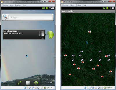
Text Flex consisted of three software products: tXtFL, Text Trix, and Jar Ajar. Now it consists of a fourth: Dr. Scenario. Dr. Scenario was born out of a Family and Community Medicine clerkship, where the community element for me was being stationed in a middle school to promote health however I could. I chose the techno route--not the music, but technology--where I designed a health-scenario-based computer game. Teens worked with a wallet to choose cost-effective treatment options for common health dilemmas.
The game actually did have a little techno music to spice things up, and that was perhaps its biggest flaw. The most common feedback: "The music sux. Give us rap music." And now they--and you--can have their rap music, downloadable in this pre-pre-release, Java-included edition.
Text Trix
Last night I looked over the "todo" file in Text Trix, a list of all the fixes and updates in the program. I was almost appalled. I hadn't realized how much time I had spent over the past four years working on that thing. And what do I have to show for it? So much time for such little things: auto-save, wrap-indent, printing, preferences, plugins, and so on. At times it's been discouraging seeing how few downloads it has had. But one day a couple months back, I had a realization. I needed to revisit my original goal for it. Instead of creating the software for the sake of downloads, I had written it because it met some of my personal needs, and I put it out there for free simply because I thought that others who might find it useful shouldn't have to reinvent the wheel. Now it's a matter of enjoying the features I add and seeing if anyone else finds it useful, too.
I also re-realized the original, underlying need that Text Trix sought to meet: to provide a way to manipulate text with ease, particularly software code. So what are these incremental changes for Text Trix? Mostly those that I found useful in organizing large numbers of files and source code.
Sonrise website
One thing I learned from a friend: don't wait for big opportunities to make little changes. One of my joys in working on the Sonrise website has been making little tweaks here and there simply to make the user experience more enjoyable, even if people don't notice the specific changes. Ken and I worked to put together a new Google Calendar and embed it in our website, complete with exam dates from med/dental/pharm schools to make it a useful reference in and out of Sonrise. It's truly made scheduling things easier for us.
Other tiny tweaks:
Next up: new pictures...
Campus Christian Fellowship
I've had so many dreams of what we might do with CCF, but have thus far lacked the manpower to implement them. Maybe God has another time and place for it down the road. In the meantime, it continues to serve mainly as a web interface, a portal for newcomers to learn about Christian opportunities on campus. Fellowships to attend. Churches to attend and fellow students to drive them there. A little encouragement at the start of a new spiritual journey.
As for the website itself, two navigational features have plagued me. My original goal was to keep as much content on a single screen as possible. I spent hours playing around with Javascripts to figure out how to make the sidebar and inner frame automatically detect the browser window height and adjust to its size. And then I implemented a model where the user has only to hover over a page navigation link (ie a link to another part in the same page), and the inner frame takes the user directly to that part of the page.
The problem was that I felt that users weren't used to the model and would accidentally hover over these links, sending them all over the page. Also, whether they knew it or not, each time they hovered over a link, it was counted in the browser as a page navigation--using the browser back key would take them back to the last link they (accidentally) hovered over within the page, not the last page. And on tests in small screens, the frames wouldn't fit within one screen, and the page would jump all around when the user hovered over these links.
So the main problems were two: 1) the hover-jump effect, and 2) the difficulty of browsing back. My solution was, sadly, to renege on the "innovative" navigational feature. Now the page only navigates when the user clicks on the links. Finally, the website experience feels clean and smooth. Or at least closer to that. There are always tweaks ahead.
Taking out the hover-jump links provided another, unexpected opportunity. I had spread out the links on the sidebar to prevent the user from accidentally hovering over too many links in a row. Now that users go directly to the links they want, and click on them, I can compact the list. And that gives more room to the sidebar. I'm now asking people to submit mini-testimonies of their spiritual journey in the City so that we can highlight them in the sidebars.
It's been quite a journey. Lots of lots of little. I can only hope that it has made people's computing experiences just a little smoother. And for me, it's been lots of fun.
Dr. Scenario
Text Flex consisted of three software products: tXtFL, Text Trix, and Jar Ajar. Now it consists of a fourth: Dr. Scenario. Dr. Scenario was born out of a Family and Community Medicine clerkship, where the community element for me was being stationed in a middle school to promote health however I could. I chose the techno route--not the music, but technology--where I designed a health-scenario-based computer game. Teens worked with a wallet to choose cost-effective treatment options for common health dilemmas.
The game actually did have a little techno music to spice things up, and that was perhaps its biggest flaw. The most common feedback: "The music sux. Give us rap music." And now they--and you--can have their rap music, downloadable in this pre-pre-release, Java-included edition.
Text Trix
Last night I looked over the "todo" file in Text Trix, a list of all the fixes and updates in the program. I was almost appalled. I hadn't realized how much time I had spent over the past four years working on that thing. And what do I have to show for it? So much time for such little things: auto-save, wrap-indent, printing, preferences, plugins, and so on. At times it's been discouraging seeing how few downloads it has had. But one day a couple months back, I had a realization. I needed to revisit my original goal for it. Instead of creating the software for the sake of downloads, I had written it because it met some of my personal needs, and I put it out there for free simply because I thought that others who might find it useful shouldn't have to reinvent the wheel. Now it's a matter of enjoying the features I add and seeing if anyone else finds it useful, too.
I also re-realized the original, underlying need that Text Trix sought to meet: to provide a way to manipulate text with ease, particularly software code. So what are these incremental changes for Text Trix? Mostly those that I found useful in organizing large numbers of files and source code.
- Group tabs: The Text Trix group. The Dr. Scenario group. The Sonrise group. Each tab group has its own set of tabs, such as the main Text Trix Java files I'm editing, or the Sonrise webpages. I found it hard to sift through 15-30 tabs, sometimes with the same name (eg "index.html" for every website). Now each group can have its individual set of associated files.
- Word Find: v.0.5.0 introduced Line Find, a permanent little box where you can type in any line number, and it'll take you there immediately. Now we have Word Find, which is just like find-as-you-type in Firefox, except that, of course, you don't want to type the words you're trying to find, so we again have a special box where you can do that.
- Song Sheet: Song Sheet is a little plugin for transposing chord-based music. While transposing "Foreverandever Etc.," a song by David Crowder Band, I realized that flats ("b") aren't counted as chords in this plugin. Shame on it! So now it does, and now I'm happy.
- Duplicate tabs: This one's still in progress. So many times while editing, I wish that I could have the same file opened simultaneously so that I could keep them scrolled to different points in the file. That becomes important when editing, say, a 4000 line file. Before, Text Trix opened multiple files, but as separate files, which could get confusing if you edited one but later switched to another, older copy. Opening the same file in multiple tabs and keeping them synchronized is the goal, and the first step toward that goal is a newly introduced mechanism that checks and warns when opening or saving over a currently opened file.
Sonrise website
One thing I learned from a friend: don't wait for big opportunities to make little changes. One of my joys in working on the Sonrise website has been making little tweaks here and there simply to make the user experience more enjoyable, even if people don't notice the specific changes. Ken and I worked to put together a new Google Calendar and embed it in our website, complete with exam dates from med/dental/pharm schools to make it a useful reference in and out of Sonrise. It's truly made scheduling things easier for us.
Other tiny tweaks:
- Updated *beta* songbook on the members page.
- Now when you brush your mouse over a hyperlink, it turns bright against a brown background, rather than getting lost in its original color.
- The contact page is now cleaner, with email addresses embedded directly in the hyperlinks.
- The number of blog headers on the front page is reduced. That allows the voting booth to be more visible on the page and encourage our continually democratic process.
Next up: new pictures...
Campus Christian Fellowship
I've had so many dreams of what we might do with CCF, but have thus far lacked the manpower to implement them. Maybe God has another time and place for it down the road. In the meantime, it continues to serve mainly as a web interface, a portal for newcomers to learn about Christian opportunities on campus. Fellowships to attend. Churches to attend and fellow students to drive them there. A little encouragement at the start of a new spiritual journey.
As for the website itself, two navigational features have plagued me. My original goal was to keep as much content on a single screen as possible. I spent hours playing around with Javascripts to figure out how to make the sidebar and inner frame automatically detect the browser window height and adjust to its size. And then I implemented a model where the user has only to hover over a page navigation link (ie a link to another part in the same page), and the inner frame takes the user directly to that part of the page.
The problem was that I felt that users weren't used to the model and would accidentally hover over these links, sending them all over the page. Also, whether they knew it or not, each time they hovered over a link, it was counted in the browser as a page navigation--using the browser back key would take them back to the last link they (accidentally) hovered over within the page, not the last page. And on tests in small screens, the frames wouldn't fit within one screen, and the page would jump all around when the user hovered over these links.
So the main problems were two: 1) the hover-jump effect, and 2) the difficulty of browsing back. My solution was, sadly, to renege on the "innovative" navigational feature. Now the page only navigates when the user clicks on the links. Finally, the website experience feels clean and smooth. Or at least closer to that. There are always tweaks ahead.
Taking out the hover-jump links provided another, unexpected opportunity. I had spread out the links on the sidebar to prevent the user from accidentally hovering over too many links in a row. Now that users go directly to the links they want, and click on them, I can compact the list. And that gives more room to the sidebar. I'm now asking people to submit mini-testimonies of their spiritual journey in the City so that we can highlight them in the sidebars.
It's been quite a journey. Lots of lots of little. I can only hope that it has made people's computing experiences just a little smoother. And for me, it's been lots of fun.

Comments